Three years after unifying our brands, Relyens has reached a significant new milestone. Discover our new visual identity, which reflects the profound evolution of our Group with its refined, bright and contemporary aesthetic.
A natural evolution for a company in motion
On 2 January 2023, Relyens became our single brand, uniting Sham and Sofaxis under a shared identity. This marked the beginning of our journey to unite our teams and present a unified face to our transformation.
Since then, Relyens has continued to evolve: our Risk Manager model has adapted, our business lines have transformed, and our European presence has grown. Therefore, it was essential that our visual identity reflect this trajectory and fully embody the momentum we have built.
“What we are unveiling today is not just a change in appearance. It is the expression of a company in motion — one that embraces its evolution while remaining true to its mission and identity. We set out to create a brand that more strongly embodies our commitment to clarity, simplicity, and high standards. A brand that dares to innovate and experiment, always with purpose and responsibility. This new visual language is designed to make Relyens clearer, more inspiring, and more distinctive.”
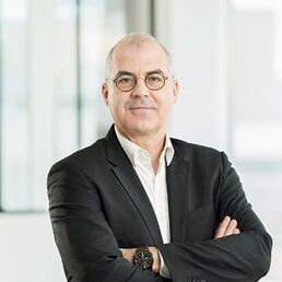
Dominique Godet
CEO Relyens
A visual identity defined by clarity and simplicity
This new visual universe, which was co-created with our communications agency, Ekno, over a nine-month period, moves away from traditional conventions to assert our position as a responsible innovator. The core principles of this new identity are built around:
- A modernised identity: A redesigned logo in outline form and the adoption of a bespoke typeface to enhance modernity.
- The primacy of white space and light: A refined, balanced visual environment that provides clarity and “visual breathing room”.
- Conceptual forms: Abstract shapes and a linear “graphic alphabet” are used to convey dynamism, connection, and mastery, without relying too heavily on figurative imagery.
- Soft gradients: A refreshed colour palette derived from the original logo colours, to enhance distinction across our communication materials.
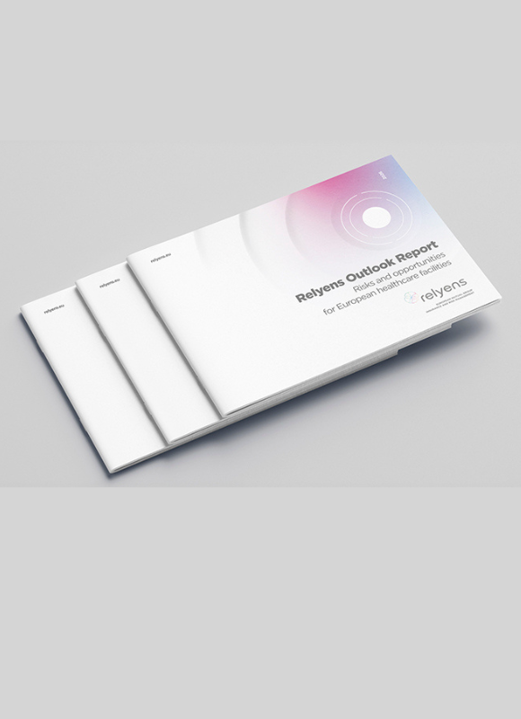
Discover our new territory in motion
A new website and enhanced digital services
This new chapter is accompanied by a complete redesign of our website, which will be effective from 3 February. The platform has been designed to provide a clearer showcase of our role as a risk manager and will be available in seven languages: French, Spanish, German, Italian, English, Dutch and Portuguese.
Client areas will also adopt this new visual identity. This evolution is intended to make navigation more straightforward, providing direct access to key information while maintaining a high level of functionality and service quality. We will continue to move forward alongside you, helping to build a safer and more resilient world.